Defaults & placeholders
When a client inserts your block, you rarely want it to appear empty. A block has two things you can give a sensible starting state to, and they're set in different places:
- Its fields — the typed controls in the Inspector (heading, button, image…). Give these a starting value with
default, or just a hint withplaceholder. Set on each control inblock.fields.json. - Its inner blocks — the child blocks inside a
<Repeater>/<InnerBlocks>slot, if the block has one. Seed these with thetemplateattribute on the marker.
Most blocks only need field defaults. Reach for template only when the block nests other blocks.
Field starting state
Each control in block.fields.json can carry a default (a real starting value) and/or a placeholder (a hint shown while the field is empty). They're independent:
default— a real saved value. The field renders pre-filled and your render reads it straight away. It's what the attribute is until the client changes it.placeholder— greyed-out hint text shown inside an empty field ("Enter a headline…"). Stores nothing; leave the field blank and the attribute stays empty.
Use default when you want the block to start with real content; use placeholder when an empty value is legitimate and you just want to nudge the author. You can set both — the placeholder shows only once the author clears the default.
Example: a CTA block that starts filled in
Take a call-to-action block with a heading, body, and a button. In the field builder, default and placeholder are just properties on a control — add them like any other. Here we give the Body a default and a placeholder:
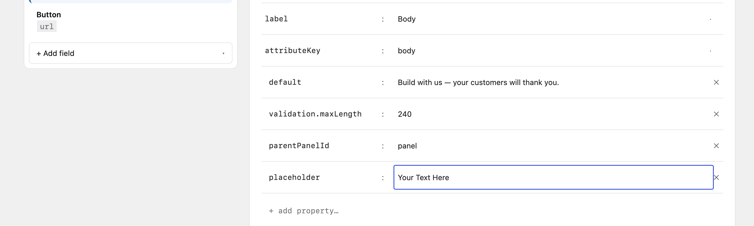
That produces this block.fields.json — which is the source of truth either way, whether you set it by clicking in the builder or by writing (or generating) the JSON directly:
{
  "controls": [
    { "id": "panel", "type": "group", "label": "CTA" },

    { "id": "ctrl_heading", "type": "text", "label": "Heading",
      "attributeKey": "heading",
      "default": "Ready to get started?",
      "parentPanelId": "panel" },

    { "id": "ctrl_body", "type": "textarea", "label": "Body",
      "attributeKey": "body",
      "default": "Build with us — your customers will thank you.",
      "placeholder": "Your Text Here",
      "validation": { "maxLength": 240 },
      "parentPanelId": "panel" },

    { "id": "ctrl_button", "type": "url", "label": "Button",
      "attributeKey": "button",
      "default": { "url": "", "text": "Get started", "opensInNewTab": false },
      "parentPanelId": "panel" }
  ]
}
In the editor, the heading shows its real default ("Ready to get started?"), while the still-empty Body field shows its placeholder ("Your Text Here") in grey — a hint, not saved content:

Your render reads the values with no special-casing:
<?php
$heading = $attributes['heading'] ?? '';
$body    = $attributes['body'] ?? '';
$button  = $attributes['button'] ?? [];
?>
<section <?php echo get_block_wrapper_attributes(); ?>>
  <h2><?php echo esc_html( $heading ); ?></h2>
  <p><?php echo esc_html( $body ); ?></p>
  <?php if ( ! empty( $button['url'] ) ) : ?>
    <a href="<?php echo esc_url( $button['url'] ); ?>"><?php echo esc_html( $button['text'] ); ?></a>
  <?php endif; ?>
</section>
default works for every control type — true on a toggle, a colour value on a colour control, an array of seed rows on a repeater field, the { url, text, opensInNewTab } object on a url control above. The shape of default always matches that control's stored value; see each control's Field reference entry for its shape.
Inner-block starting state
If your block has an inner-blocks slot (the InnerBlocks repeater), seed its children on insert with the template attribute on the <Repeater> (or <InnerBlocks>) marker.
This is WordPress's native InnerBlocks template — GCB passes it straight through to core's <InnerBlocks template={…} />, no custom shape. It's a list of [ blockName, attributes, innerBlocks ] entries (the third element nests children for container blocks). The only GCB-specific part is that on the marker you write it as a JSON string; GCB parses that into the array WordPress expects. For the full spec and nesting rules, see WordPress's block templates docs.
<div class="grid">
  <Repeater
    allowedBlocks='["gcb/feature-item"]'
    addButtonLabel="Add feature"
    template='[
      ["gcb/feature-item", {"title": "Fast"}],
      ["gcb/feature-item", {"title": "Flexible"}],
      ["gcb/feature-item", {"title": "Yours"}]
    ]'
  />
</div>
Insert the parent and three feature-items appear. Each child's own field defaults apply on top of whatever the template sets — so the two layers compose: keep the template lean and let the child block carry its own field defaults.
template seeds the children; the <Repeater> Add button stays available so the client builds beyond the template. To lock the structure (no add/remove), pair template with templateLock on <InnerBlocks> — see The InnerBlocks repeater.
Headless note
default and template resolve at insert time, in the editor. By the time content is saved, the block just has ordinary attributes and inner blocks — your frontend reads the saved attributes (defaults already baked in) and renders the saved innerBlocks like any other block. placeholder never reaches the frontend at all; it's an Inspector-only hint.